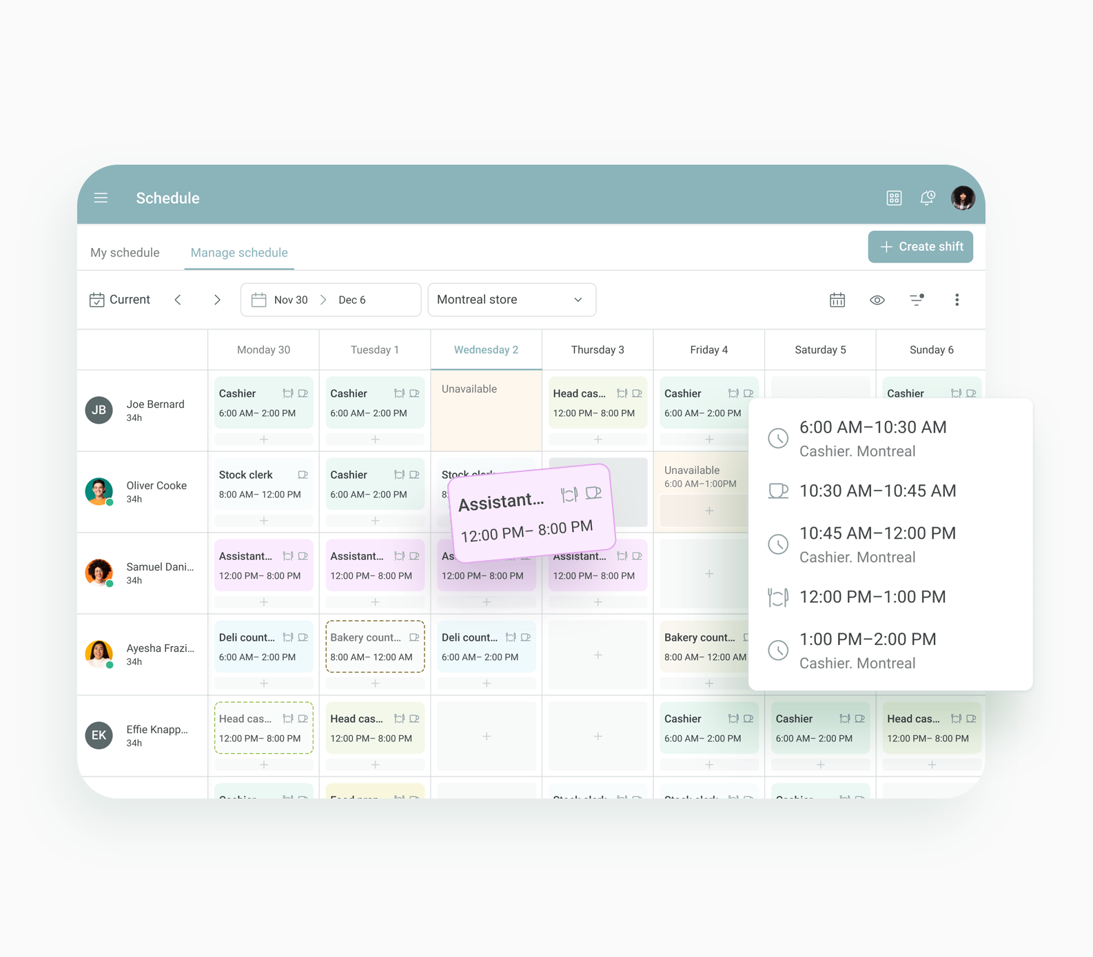
I improved the design of the manage schedule feature to optimize the visual hierarchy, enhance productivity and streamline the management process

Lead product designer
Content designer
Web
Manage Schedule is the place where managers go within the WorkJam app to get a snapshot view of daily or weekly labor coverage. While it is not a scheduling engine, managers can edit and add shifts to ensure they have adequate staff on the floor. However, the current user experience is affecting how easily managers find content and complete scheduling tasks.
Managers are finding it tough to quickly locate what they need and efficiently handle tasks like editing and adding shifts. This is making it harder for them to ensure they have enough staff on the floor. We need to make some UI improvements to streamline the process and make their experience smoother.
For this project, I conducted 4 interviews with floor managers from different industries to get a clear picture of the information they need at a glance to make quick and informed decisions. They all highlighted the same keys points: They need to know when to add shifts and which employees are best suited for those shifts, taking into account various factors like skills, availability, and past performance.
There’s a lot of data that can help with these decisions, but the challenge was to present all this information in a way that’s clear and not overwhelming. My goal was to ensure that all relevant details were easily accessible, helping managers make the right choices without getting bogged down by too much information at once.
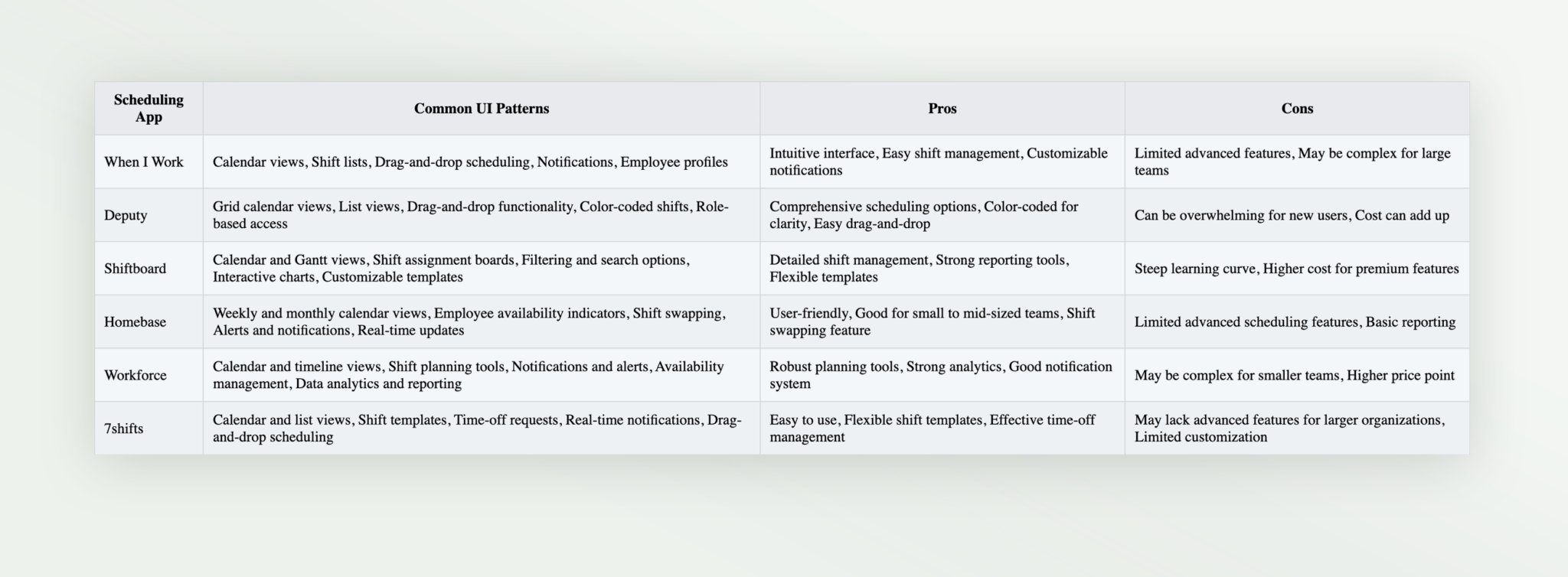
In my explorations, I studied various scheduling apps to identify commonly used UI elements, gestures, and patterns. I gathered insights into what made these designs effective and user-friendly, which laid the groundwork for our new UI.
This project is quite extensive, involving multiple views and configurations for managing schedules. Throughout the process, I held numerous design reviews with the design team and presented prototypes to stakeholders, including department heads and operational managers. Feedback from these stakeholders focused on ensuring that the UI met practical needs, streamlined workflows, and supported their decision-making processes.
Additionally, I gathered input from the customer success teams to address any potential usability issues and ensure that the design aligned with real-world use cases.

Wrapping up this project, I’ve learned a lot about balancing complex information with user-friendly design. Diving into various scheduling apps gave me a solid foundation in effective UI elements and patterns. It was eye-opening to see how different designs handle the same challenges and what makes them work well.
Overall, this project reinforced how crucial it is to blend user insights with practical design solutions. I’m excited to see how these improvements will help managers streamline their scheduling tasks and keep everything running smoothly.