I led the design of the Manage Schedule feature, optimizing visual hierarchy, enhancing productivity, and streamlining workforce management to help managers quickly interpret data and make informed decisions.
Lead product designer
Design team, Design systems lead, Content designer
Web responsive
WorkJam is an all-in-one workforce management platform that helps businesses streamline operations, improve employee engagement, and enhance productivity. By integrating scheduling, communication, training, and task management into a single platform, Workjam empowers frontline workers while giving managers the tools they need to optimize workforce efficiency.
Employee scheduling is a critical feature in WorkJam, but it wasn’t being utilized to its full potential. The existing system lacked key visual elements, making it difficult for managers to quickly interpret scheduling data. Our goal was to enhance usability by at least 50%, ensuring managers could make faster, more informed decisions.
Key Objectives:
I worked closely with the customer success team and industry knowledge leaders to gain deeper insights into the specific needs of floor managers. I also conducted four interviews with managers from various industries to understand the critical information they require at a glance to make quick, informed decisions. Common themes emerged from these conversations: managers need to know when to add shifts and which employees are best suited, factoring in skills, availability, and past performance.
Given the wealth of data available, the challenge was to present this information clearly and concisely, without overwhelming the user. My goal was to ensure that all relevant details were easily accessible, empowering managers to make the right decisions efficiently.
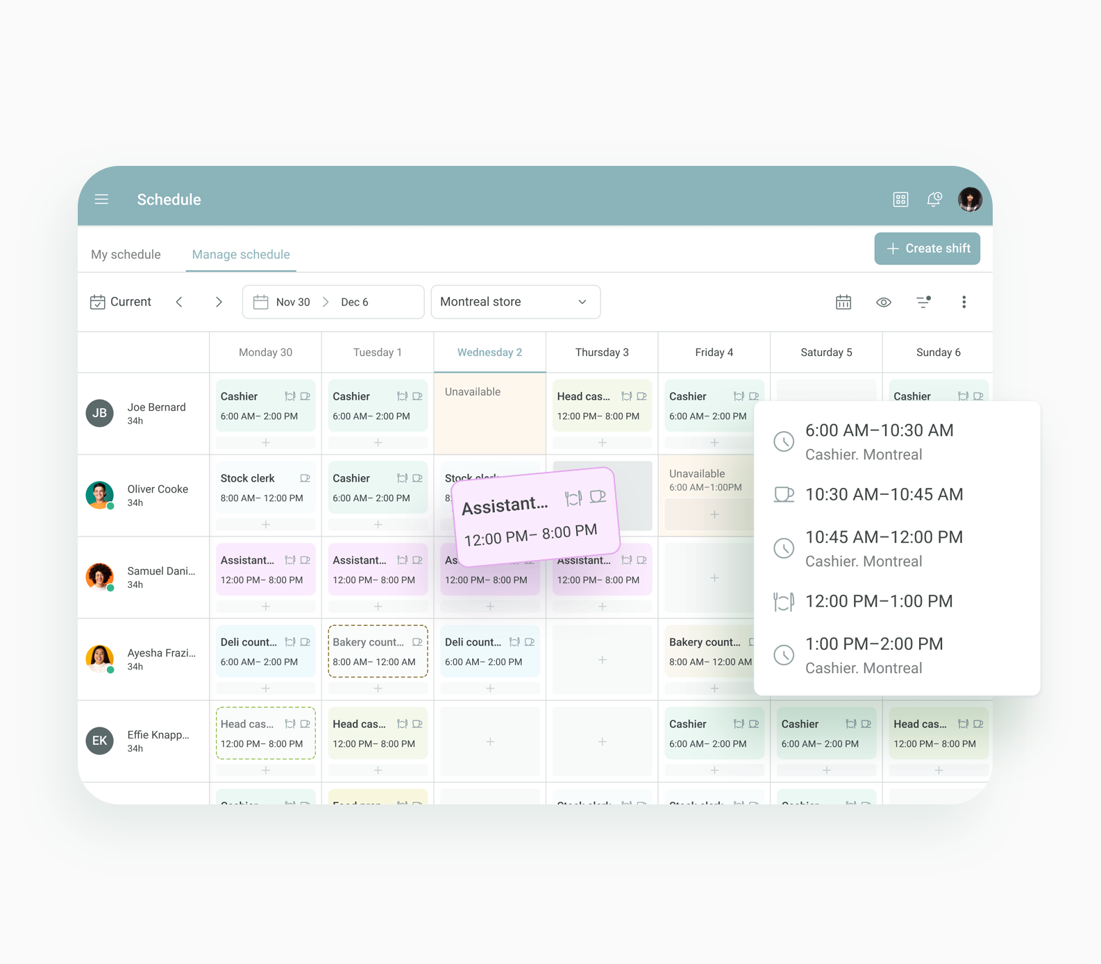
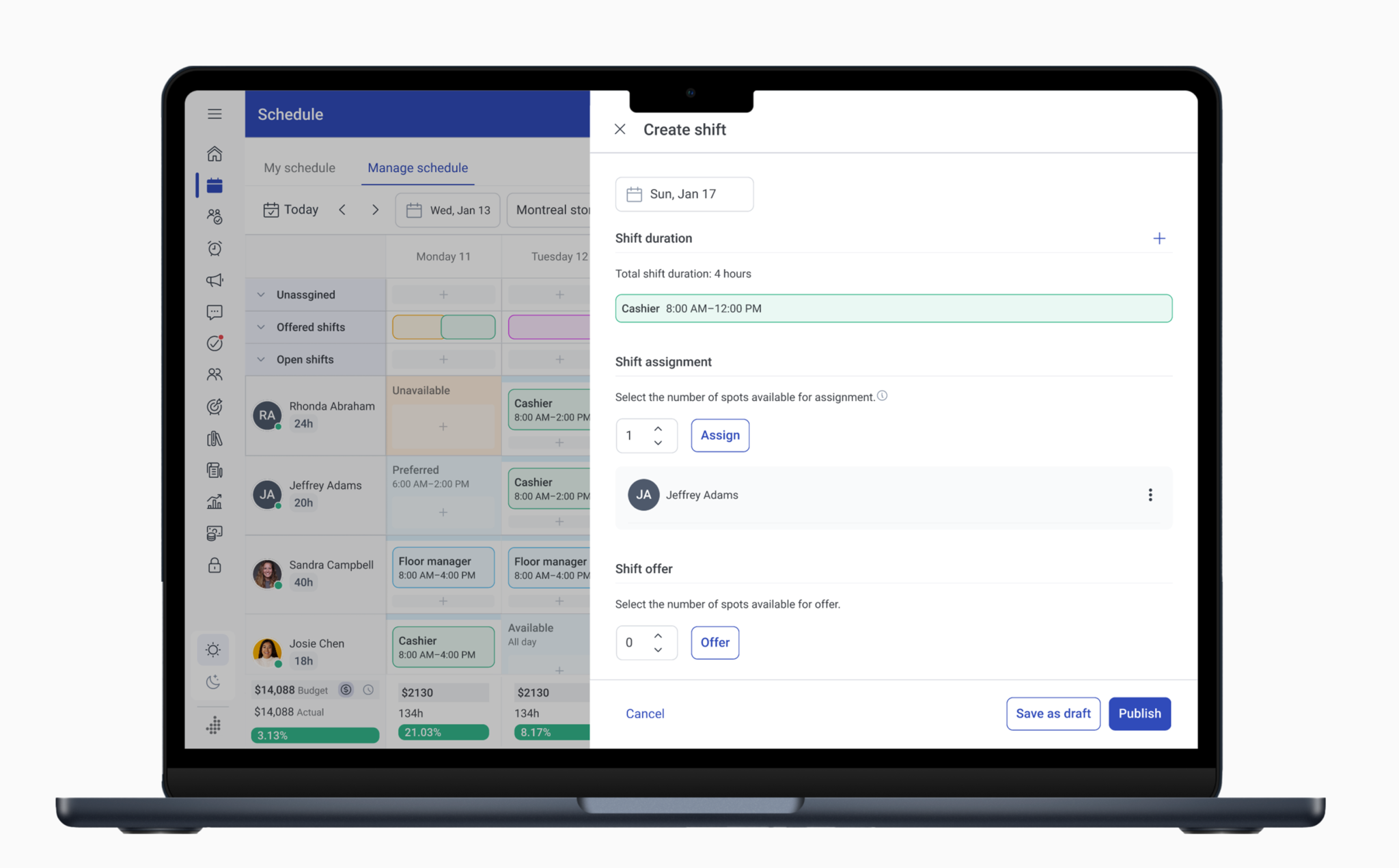
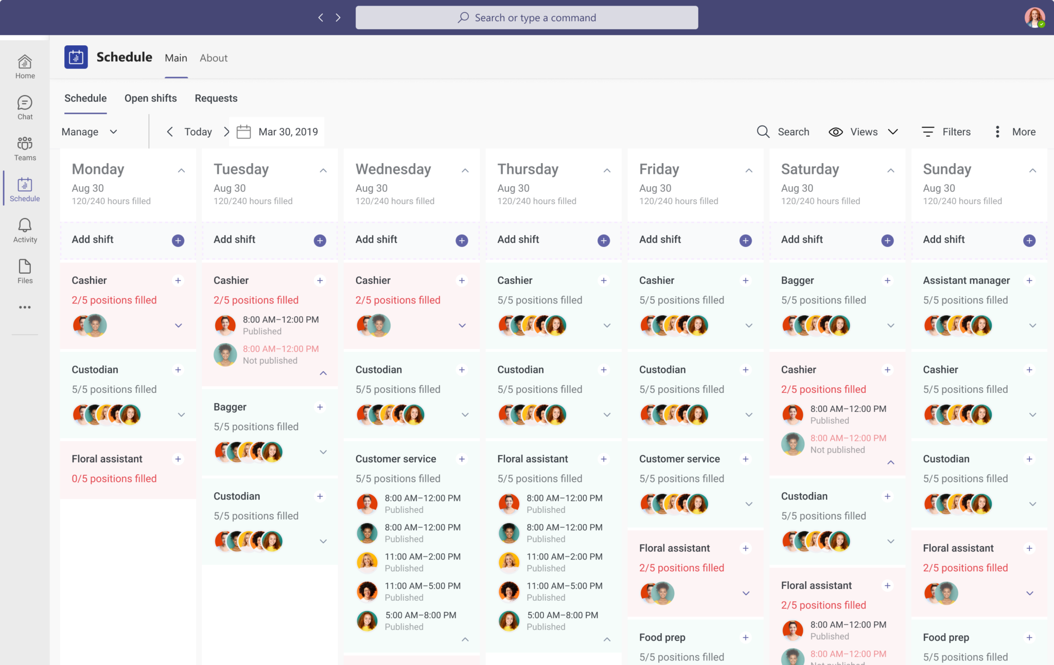
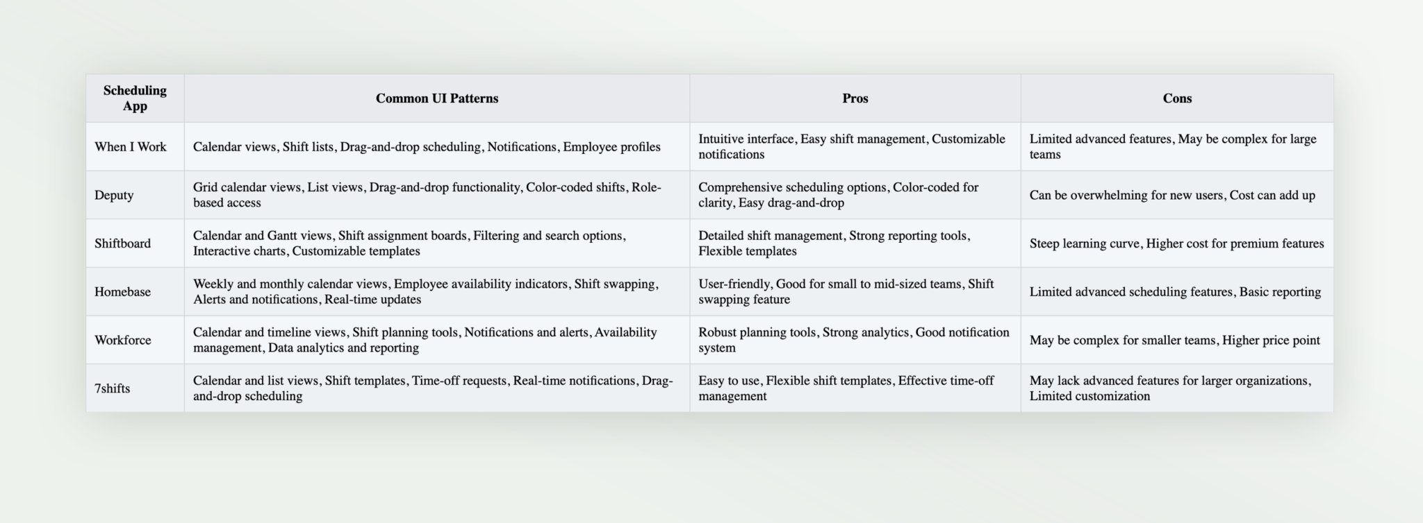
To inform the design, I explored a variety of scheduling apps to identify commonly used UI elements, gestures, and patterns. I analyzed what made these designs effective and user-friendly, which became the foundation for our new interface.
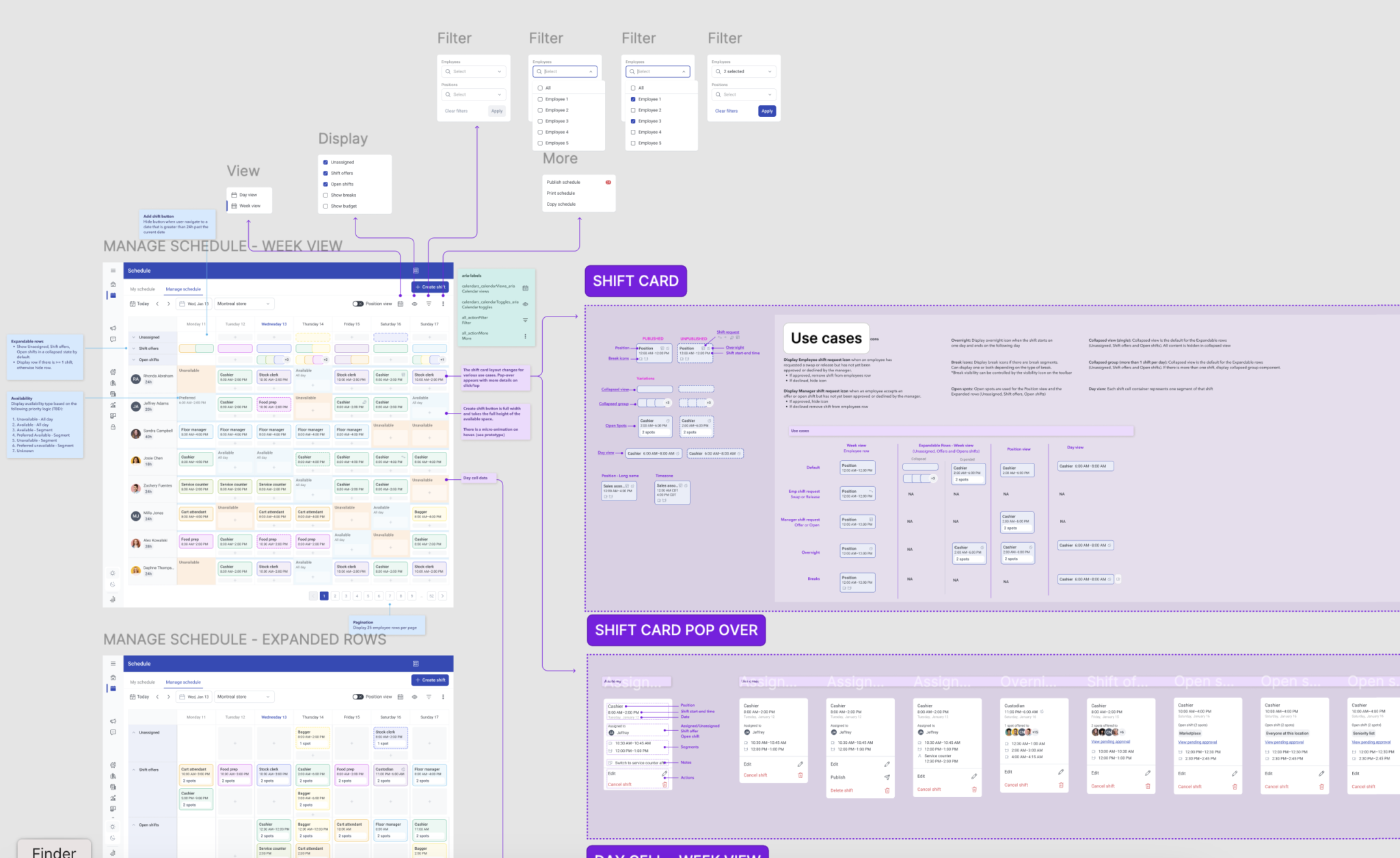
Given the complexity of the project, which involved multiple views and configurations, I conducted regular design reviews with the design team. I also presented prototypes to stakeholders, including department heads and operational managers, to ensure the design met their needs. Feedback from these sessions focused on making sure the UI streamlined workflows and supported their decision-making processes.
In addition to stakeholder feedback, I collaborated closely with the customer success team to identify and address potential usability challenges, ensuring the design was aligned with real-world use cases and would enhance the overall user experience.
The initial direction involved using a masonry-style grid layout to create a flexible, visually appealing structure for displaying scheduling data. However, after testing with real users, we found that the grid was difficult to navigate for quickly comparing and analyzing data, which was crucial for decision-making. This led us to pivot and refine the design to prioritize clarity and ease of use.
Throughout this exploration phase, I continuously worked with the design team to evaluate different approaches and hone in on a solution that would meet the needs of managers in real-world environments.
Wrapping up this project, I gained valuable insights into balancing complex information with intuitive, user-friendly design. Here are some key takeaways:
Overall, this project reinforced the importance of blending user insights with practical design solutions. I’m excited to see how these improvements will help managers streamline their scheduling tasks and keep everything running smoothly.