
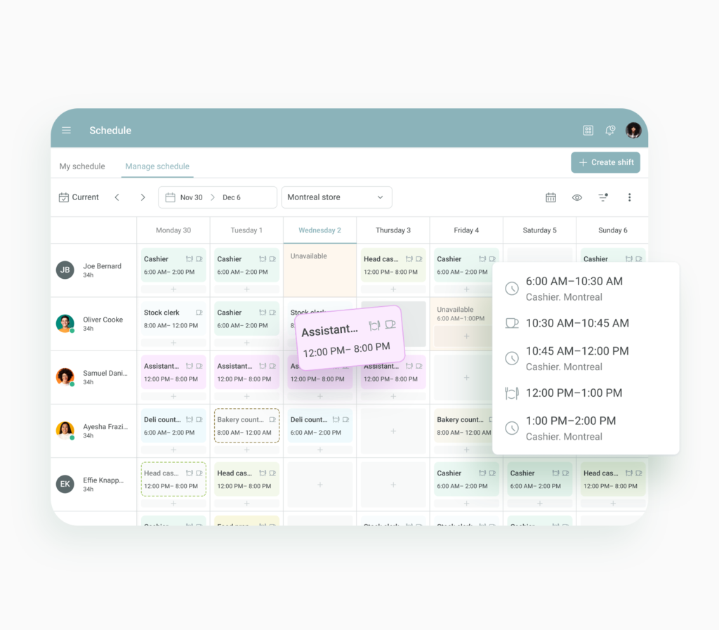
I improved the design of the manage schedule feature to optimize the visual hierarchy, enhance productivity and streamline the management process
Lead product designer
UX Researcher, Content designer
Web responsive
After launching the MVP for WorkJam’s timecard feature, we knew there was room for improvement, especially when it came to editing timecard entries.
Right now, users can only edit one entry at a time….and intially that seemed like it would do What we didn’t expect was that a lot of front-line workers aren’t always clocking in on time, or sometimes they forget altogether. so they would catch up and correct their timesheet right before their pay cycle ended. All those entries was eating up so much of their time. We needed to simplify this process, make it faster and more user-friendly. Ultimately, we wanted to boost efficiency and ensure that timekeeping is accurate without all the hassle.
In preparation for this project, I collaborated with a user research analyst to conduct client interviews, Analyze Google Analytics data and A/B Testing.
We saw a large amount of missed punches and inconsistencies and learned while interviewing managers and employees that the punch clock was confusing and managers were spending a lot of time correcting their employees timecards.
The testing revealed a critical metric: 89% of users discontinued using timecards after just a few minutes, citing the prolonged editing time required for a high volume of punches. This finding helped build the case for the addition of batch entry capability in timecards.
Sandy Lumin, Cashier
In our brainstorming sessions, we really wanted to tackle the pain points head-on. We gathered around the table, armed with sticky notes and coffee, ready to dive into the nitty-gritty of our users’ experiences. We listened intently to feedback, noting every frustration and every suggestion for improvement. It was all about understanding the real issues our users were facing and finding innovative ways to address them.
As we tossed around ideas, there was this sense of excitement in the air. We knew we wanted to streamline the editing process, but we also wanted to make sure it was intuitive and user-friendly. We scribbled down sketches, debated over features, and tossed out ideas that just didn’t make the cut. It was a collaborative effort, with everyone bringing their unique perspectives to the table.
We landed on a solution that we believed would be intuitive for the user. It was all about simplifying the entire experience.
Learning from this project encompassed a mix of positive and challenging aspects, providing valuable insights for future endeavors. Here are some key takeaways:
The analysis of data proved to be a powerful tool for making informed decisions. The identification of the 89% drop-off rate after five minutes provided a clear focus for addressing a critical usability issue.
Clear communication with stakeholders and managing expectations emerged as critical aspects. Learning how to convey the impact of proposed changes, potential delays, and the iterative nature of the development process became essential for fostering understanding and cooperation.